

IKEA Cottagecore Ideas: 10 Affordable Finds and 5 Practical Styling Tips
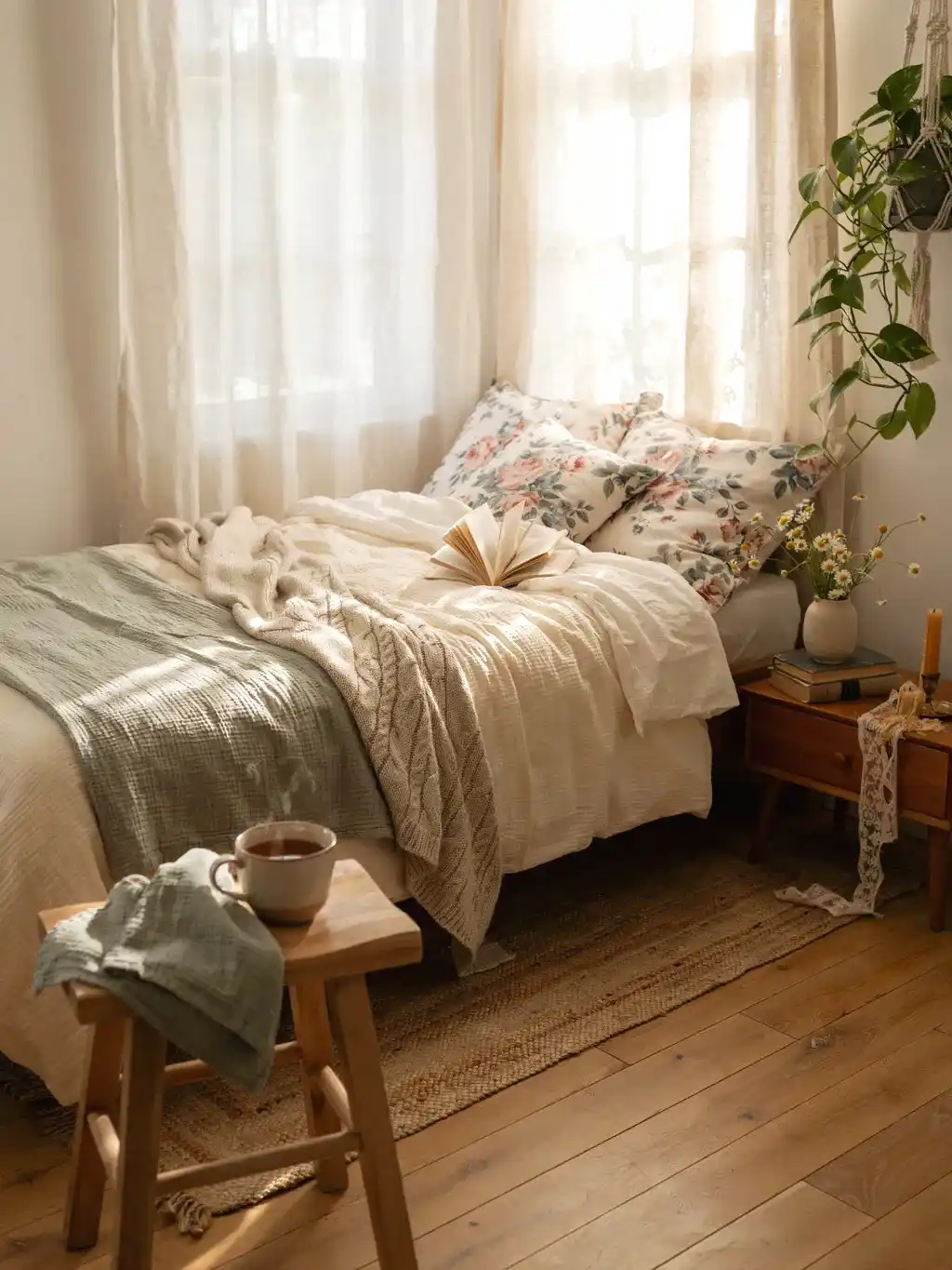
Cottagecore decorating starts with familiar comforts: a useful basket, a favorite cup, soft fabric, and a few stems beside the window. IKEA basics can support that look when you choose them for their shape, material, and place in the room. You do not need a matching collection or a cart full of themed accessories.
The most effective approach is to finish one small area first. Decide whether you need a reading light, more attractive storage, or a softer bedside arrangement, then build around that need. Mix a plain new piece with books, inherited objects, or something you have made yourself.
This guide brings those decisions together: what to look for at IKEA, which product examples can be checked, and how to arrange a shelf, bedside table, tea station, or reading corner. Start with a palette, then choose the styling plan that fits your space.
Shopping note: The photographs are styling inspiration, not verified matches to current IKEA products. Named examples below link to official listings. U.S. prices were checked on October 20, 2026; prices, finishes, sizes, and availability differ by country and can change.
Choose a Cottagecore Palette That Works With Your Room
Let the Existing Furniture Set the Starting Point
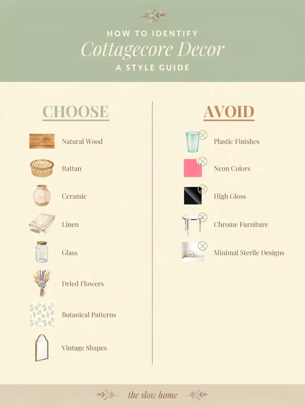
Identify the largest finish you are keeping: perhaps a dark bed frame, white cabinets, or a honey-colored table. Choose accessories that connect with it instead of buying a separate “cottagecore” palette that ignores the room.
For dark wood, try cream ceramics, faded blue, and a little warm metal. With white furniture, add a warmer basket or cork surface before introducing another white object. If the room already has patterned curtains, take a color from those curtains for the smaller details.
Use the palette as a filter, not a strict rule. One brighter keepsake can belong in the room; repeating its color in a small textile or print helps it feel connected.
| Direction | A simple color combination | Materials to repeat | Keep the effect balanced |
|---|---|---|---|
| Garden cottage | Warm white, leafy green, muted clay | Terracotta, glass, wood | Use greenery as an accent rather than covering every surface. |
| Soft vintage | Cream, faded rose, warm brown | Ceramic, cotton, aged-looking metal | Choose one floral pattern and give it a plain background. |
| Country kitchen | Off-white, dusty blue, golden wood | Stoneware, cork, clear glass | Let daily-use objects provide most of the display. |
| Woodland cottage | Oatmeal, moss green, dark brown | Woven fibers, wood, textured fabric | Add a pale object where the darker pieces become hard to distinguish. |
Use Fabric to Connect the Hard Surfaces
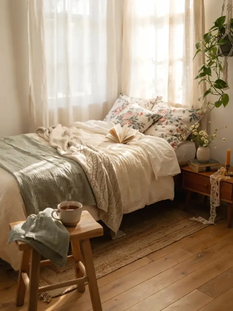
A textile can do more than another ornament when a room feels hard or bare. Try a cushion cover on a chair, a washable runner on a sideboard, or a tea towel used for its intended purpose in the kitchen.
Choose one pattern at a time. Pair a small floral print with plain cushions or a woven basket, rather than combining several equally busy florals in the same corner. Repeat one color from the pattern in a mug, frame, or pot.
Check the full purchase cost: a cushion cover may need an insert, and a runner must fit the furniture. Read the fiber and care information instead of assuming a linen-look fabric is linen. Keep decorative fabric away from cooking appliances and open flames.
Ten Useful Building Blocks to Look For at IKEA
You are choosing roles rather than collecting ten mandatory purchases. Start with what you own, then fill an actual gap. A vase is useful when you want to display stems; another vase is unnecessary when there is already a suitable jar in the cupboard.
A Small Faux Plant for an Awkward Corner

A compact artificial plant can add a green accent where maintaining a live plant is impractical. FEJKA artificial potted Pilea is one verified example; the linked version has a 3½-inch inner pot. Check the whole product’s dimensions before choosing an outer container.
Place one plant beside a shorter object rather than lining up several identical pots. If you use an outer basket, make sure the pot rests securely inside it. The basket should frame the plant without swallowing the foliage.
Styling adjustment: If the plant looks too small beside a large frame, move it to a narrower shelf or side table. Adding several more miniature plants is not the only way to fix a scale mismatch.
A Candle-Like Accent Without an Open Flame

For a bedroom, crowded shelf, or corner filled with textiles, use an LED candle to suggest a warm glow. Choose a simple shape that can sit beside the rest of the arrangement without needing a separate stand.
Keep real scented candles as a separate, supervised choice rather than making them part of a nest of dried flowers and fabric. The U.S. Fire Administration recommends considering battery-operated flameless candles. A lit candle needs the clearances and handling its instructions specify.
Style it: Put one light near the back of a small group, with a lower ceramic bowl in front and enough separation to reach both. You do not need candles at every height to make the corner feel warm.
A Narrow-Neck Glass Vase for a Few Stems
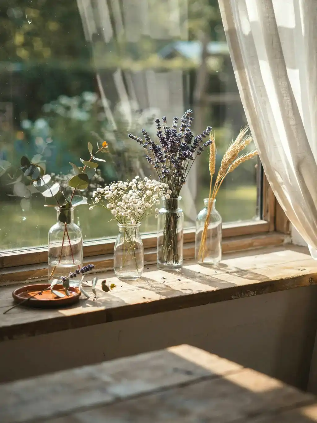
A small opening makes a limited number of stems easier to arrange. The 6-inch BERÄKNA clear-glass vase is a current example, distinct from the unverified vase name used in the earlier product list.
Start with one taller stem and one shorter supporting stem. Turn the vase so the stems spread into the open space beside it rather than crossing a picture or lamp. A sparse arrangement can look deliberate when the container suits it.
Before using water: Confirm that the vessel is intended for it, protect the furniture beneath, and leave room to lift the vase for cleaning. Do not tuck a water-filled vase behind electrical fittings just to complete a vignette.
A Stone-Textured Accent Instead of an Unverified Diffuser

Use the pictured idea for its texture, not as evidence of a currently sold IKEA diffuser. A small stone-colored dish or textured ceramic object can introduce an earthy note without adding fragrance equipment.
Place it beside a smooth glass vessel or a plain wood frame so the contrast is visible. On a narrow surface, one low textured piece is enough; a collection of loose stones can make cleaning harder.
Keep the use appropriate: Do not add oils to a decorative vessel unless the product is specifically intended for that use. Its appearance does not establish that it is suitable for fragrance liquids, heat, or skin contact.
A Small Warm-Metal Detail
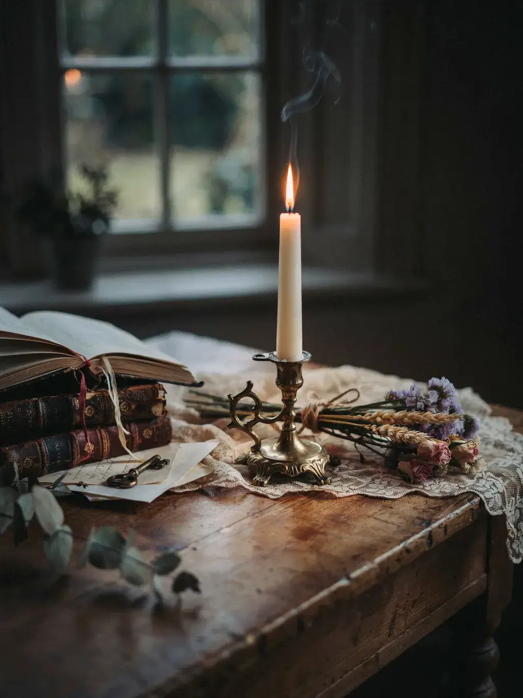
A warm metal accent can connect cottage-style ceramics with darker furniture. Look for a simple holder, frame, or tray in a finish that repeats another detail in the room.
Use it as a small contrast rather than changing every accessory to gold. A warm-metal frame beside a pale pot and a worn book is enough for a bedside arrangement. If the object is a candle holder, pair it only with a compatible candle or use it unlit.
Edit the surrounding texture: Lace, woven fibers, ornate metal, and patterned ceramics can become busy when grouped together. Choose one detailed surface and let the others stay quieter.
A Shallow Bowl With a Real Job

A small bowl earns its place when it catches rings, hair ties, or another everyday item. Choose the diameter by what it needs to hold, not just by how it looks on the shop shelf.
Keep it near the point of use: jewelry beside a dressing mirror or keys near the entrance. A low bowl also balances a taller frame or vase without blocking it.
Buying check: Seasonal patterns can work year-round if they fit your palette, but avoid buying only because a collection is temporary. Decorative bowls are not automatically food-safe; check the intended use before serving food in one.
A Mug You Will Actually Reach For

For a tea corner, choose a comfortable mug before a display mug. Consider its size, handle, weight, and care instructions. The blue 13-ounce GLADELIG mug is a verified stoneware example with a reactive glaze; it is not the unverified mug name in the original copy.
Display one or two daily-use cups where they can be reached without lifting a vase. Let the glaze color repeat a detail in a tea towel or print. There is no need to replace every cup to establish the style.
Practical limit: Keep any collection within the available shelf space and load limit. A stack that looks attractive is not useful if it is unstable or awkward to lift apart.
Cork Coasters That Bring the Palette Down to the Table

A coaster adds a small patch of warm color to a pale table without taking up display space. IKEA 365+ cork coasters are a verified option; the linked size comes in a two-pack.
Place a coaster where you naturally set a drink, then keep the nearby decor outside that landing spot. When not in use, a small stack beside the cups can be part of the arrangement.
Fit check: Compare the coaster with the base of your mug. A coaster intended for drinks is not automatically a suitable trivet for cookware or a fully waterproof barrier; follow its care and use instructions.
A Basket Sized for Its Contents
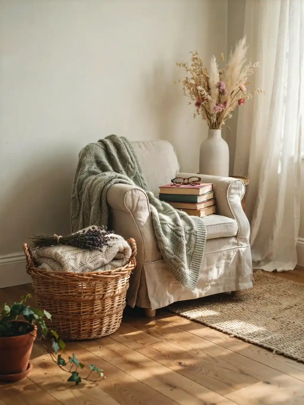
Choose the storage problem first: chargers, craft supplies, napkins, or a lightweight throw. Measure the usable opening and interior, including any taper, before deciding that a basket will fit.
On a shelf, leave enough height to lift the basket out. Under a side table, check that handles do not catch on the apron or legs. One basket with a defined job often looks more settled than several small baskets filled with unrelated objects.
For a plant: Treat a woven basket as an outer decorative container, not a waterproof pot. Remove the plant for watering and use appropriate protection inside. Do not rely on the weave to contain leaks.
A Reading Lamp That Leaves the Table Usable

A clamp lamp can free the surface of a small bedside table or reading stand. The linked NÄVLINGE LED clamp spotlight has an adjustable arm and head and a built-in 2700 K warm-white LED. Check the model’s clamping range and installation instructions for your furniture.
Position the head to light the page rather than shine toward your eyes. Check it while seated or lying in the position where you read; a lamp can look correctly placed from the doorway and still produce glare in use.
Budget correction: The checked U.S. listing is above $10. Count the lamp as a functional purchase and decide whether it solves a real lighting problem before spending on smaller decorative additions.
Verified Product Examples: Compare the Exact Size and Total Cost
These examples provide a checkable starting point, not a claim that the inspiration images show these exact products. Listed prices are from the U.S. pages checked on October 20, 2026, before tax or delivery. Select your country and store to check your own price and availability.
| Official IKEA example | Listed U.S. price | What to factor into the purchase |
|---|---|---|
| FEJKA Pilea, 3½-inch inner pot | $7.99 | An optional outer pot is a separate cost. |
| BERÄKNA vase, 6 inches | $4.99 | Other sizes have different prices; stems are extra. |
| IKEA 365+ cork coaster, 3½ inches | $2.99 per two-pack | Compare the pack quantity and usable diameter. |
| GLADELIG blue mug, 13 ounces | $6.00 each | The checked page lists a minimum online order of two. |
| NÄVLINGE black LED clamp spotlight | $21.99 | Check the exact model and a suitable clamping surface. |
Five Complete Cottagecore Styling Plans
Each plan begins with a useful setup and adds a small amount of decoration. The measurements are example layouts to test against your furniture, not required dimensions or installation instructions.
Plan One: A Cottagecore Shelf With Three Clear Roles
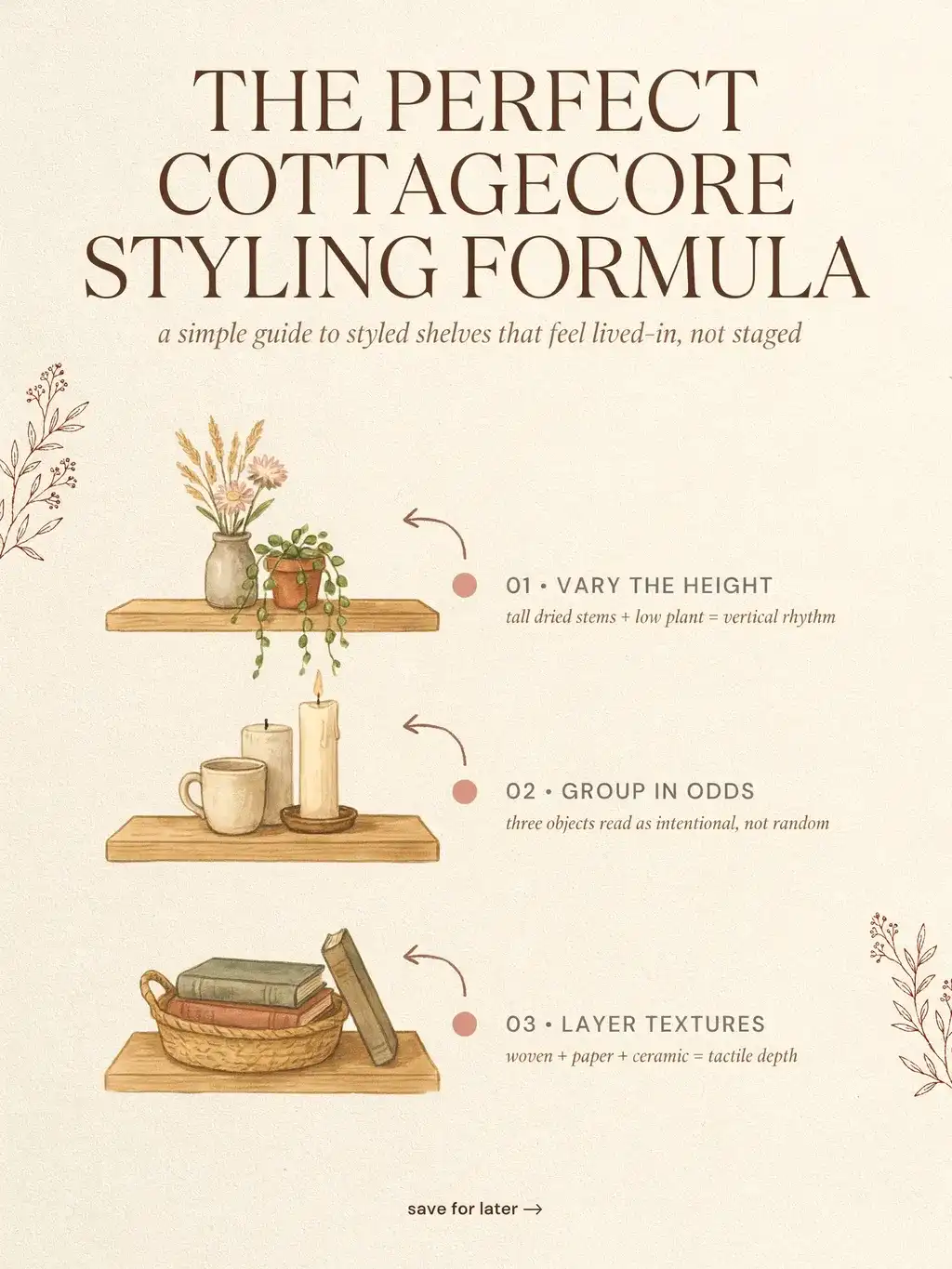
Gather: One frame or upright print, a short book group, and one plant or vase. Choose two repeated colors and one main wood or woven finish. Keep the tallest piece as the focal point instead of giving every object the same height.
Arrange: On a 90 cm-wide shelf, try a frame within roughly the left third and a lower book group toward the right. Leave a visible break between them. Place the smallest accent beside a group, rather than using it to fill the gap. The base and frame stand must fit the usable depth.
Refine: Check the arrangement from the doorway and from the bed or chair. If the objects merge together, change a height or move a darker piece beside a lighter one. Follow shelf installation and load limits; a styling sketch does not establish safe capacity.
Leave out: Additional miniature ornaments that do not add a new shape, useful function, or personal meaning. A shelf with three clear roles is easier to maintain than a row of unrelated purchases.
Plan Two: A Reading Corner Built Around the Seat

Gather: A chair you already own, suitable reading light, a reachable drink surface, and storage for the book or throw. Add a cushion only if it improves comfort; it should not push you out of a usable sitting position.
Arrange: Put the light where it illuminates an open book without shining into your eyes. Position the table so you can set down a drink without stretching across the lamp or plant. Put the basket within reach while keeping it out of the walking route.
Style: Repeat the cushion color in a book cover or small ceramic piece. A plant can sit farther back in the corner if it suits the light conditions, while the useful surface stays clear. Keep leads managed without trapping them beneath furniture.
Budget rule: Do not promise a complete nook for a fixed small sum unless the furniture, light, and accessories have all been priced. Reusing the chair and table is what makes a modest accessory refresh possible.
Plan Three: A Cottage Kitchen Tea Station

Gather: Two daily-use mugs, a coaster, a small tray if helpful, and storage for the tea you drink. Keep a separate clear area for preparing and setting down hot drinks.
Arrange: Place mugs closest to the serving edge, with tea supplies behind or beside them. A tray can group the dry items, but it should not make everything harder to reach. Keep appliances positioned according to their instructions, with decoration clear of heat and steam.
Add the cottage detail: Use one patterned tea towel or a small botanical picture near the station, rather than several signs and ornaments. A clear glass jar can hold suitable dry goods if it is intended for food storage and has the closure you need.
Keep it usable: Preserve ingredient, allergen, and date information when decanting. If you use the tea every day, accessible original packaging inside a basket may be more useful than a row of matching jars.
Plan Four: A Small Botanical Wall Above Useful Furniture
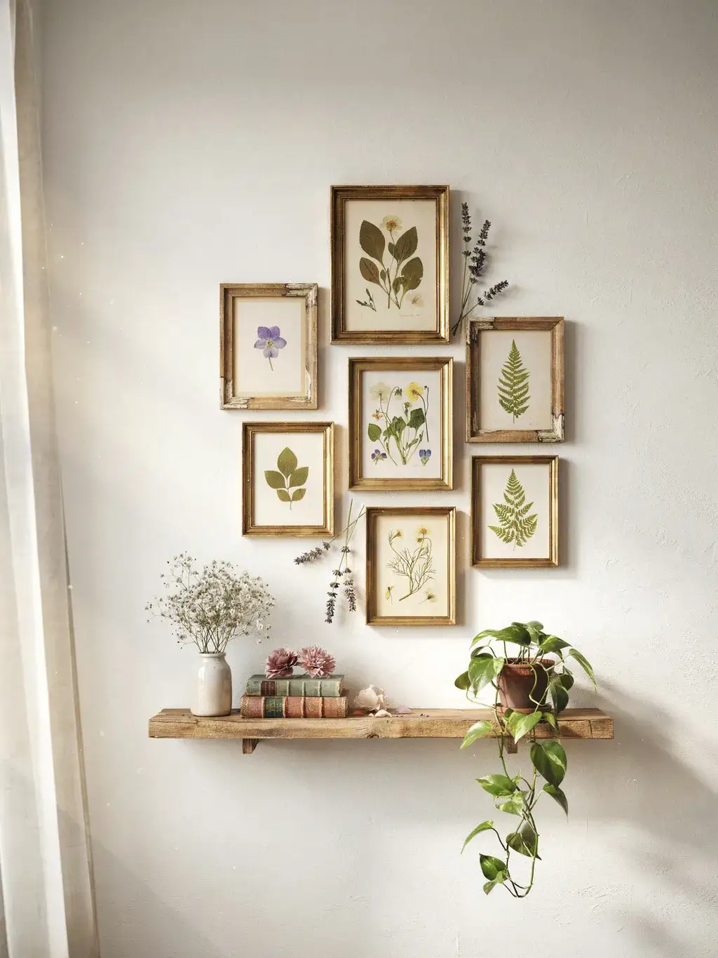
Gather: Three pictures linked by subject or color: botanical prints, postcards, or your own drawings. Use artwork you own or have permission to reproduce. Matching frame finishes can connect different image styles.
Arrange: Test paper templates on the wall before making holes, using a method suitable for the surface. Keep the gaps broadly consistent and judge the whole group in relation to the dresser or desk below it, rather than centering each picture independently.
Style the furniture: Put one low bowl or basket beneath the group and leave the work surface usable. The wall already provides detail, so the tabletop does not need a competing collection of tall objects.
Rental check: Use fixings appropriate to the wall, frame weight, manufacturer’s instructions, and your tenancy rules. No adhesive system can be assumed to remove cleanly from every paint finish.
Plan Five: A Window-Side Plant-and-Book Group

Gather: One plant suited to the actual window conditions, an appropriate pot and saucer, and a few books if the location is suitable for them. A faux plant is an alternative where the position is impractical for living greenery.
Arrange: Keep the plant clear of window handles and curtain movement. Place the books where they will not be splashed during watering. On a narrow sill, use one stable pot rather than forcing a cluster along the full width.
Add texture: Let the pot provide the cottage detail through a simple ceramic finish or muted color. A basket cover is optional; adding one is useful only if it fits the plant and protects the surface.
Maintain: Remove the plant to water where practical, allow excess water to drain, and protect the sill. Choose plant care based on the species and conditions rather than treating all “easy” plants as interchangeable.
Build Atmosphere With Light, Stems, and Space
Separate Warm Color From Useful Brightness

A warm light color and a low light level are different choices. A room can have warm-toned lighting that is still bright enough for reading. Aim for comfortable ambient light plus a task light where you need it, rather than dimming the whole room until it is difficult to use.
Check the bulb or integrated light specification for color temperature, brightness, and compatibility with the fitting. A shade changes the light distribution; a dimmer works only when the products are compatible.
Style test: Look at the corner after dark before buying another lamp. Move an existing suitable light, check for glare, and see whether a pale object or lighter textile makes the arrangement easier to read.
Let Fragrance Be Optional

The look does not depend on a scented room. Clean textiles, comfortable lighting, and a considered arrangement can provide the atmosphere without candles, oils, or potpourri.
If you choose fragrance, use one product intended for that purpose and follow its instructions. Do not mix several scented layers simply because they are displayed in different corners. Check the preferences and needs of the people and animals sharing the space.
Styling alternative: An empty lidded ceramic box or unscented decorative object can give the same shape and color. You can keep the visual layer without adding another product to maintain.
Use a Small Stem Arrangement With a Clear Outline
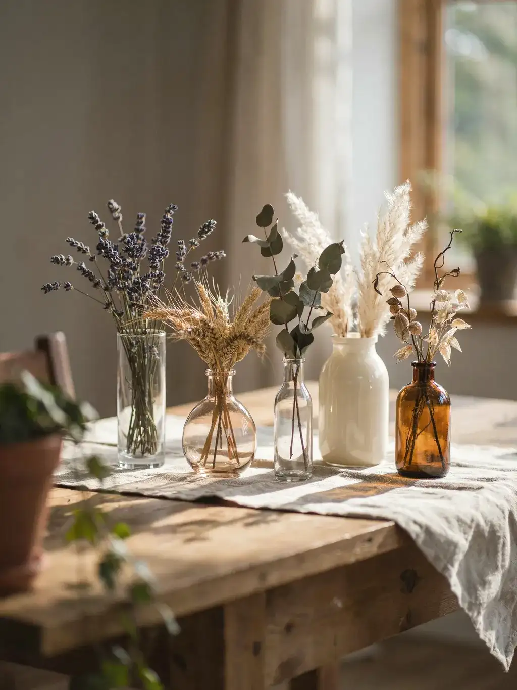
Select a few stems of different lengths rather than filling every vase to the rim. Trim gradually and turn the container as you work. One branch with an open shape can be more effective on a narrow surface than a large bunch.
For dried arrangements, keep the stems clear of heat sources, lights, and active candles. Choose a container stable enough for the height of the display and keep it where the stems will not brush against passing people.
Source thoughtfully: Use garden clippings you are permitted to take or bought stems. Do not assume that plants on a public walk are available to collect, and avoid bringing unidentified material into a home where it may be handled or chewed.
Shop With a Short List and a Measured Space
Check the Exact Listing Before Planning the Trip

Save the article number, dimensions, finish, pack quantity, and price for each item you intend to buy. Search your local IKEA site rather than assuming a product listed in another country is available near you.
IKEA’s U.S. FAQ explains how to check a selected store’s stock on the product page. Availability can differ between a store and delivery. Recheck before traveling, and do not treat a product name alone as confirmation of size or material.
A useful fallback: Write down the role you need to fill, such as “a shallow bowl that fits the bedside tray.” You can assess a substitute against the same measurements instead of buying the first vaguely similar item.
Make Seasonal Finds Earn a Year-Round Place

A seasonal collection can supply a color or pattern you like, but it is not a reason to buy urgently. Decide whether the piece works without the rest of the seasonal display around it.
A plain patterned bowl may suit the room after the season ends. A heavily themed ornament may need storage for most of the year. Both can be valid choices, but they solve different needs.
Try this question: Where will the item live next week, and what will it replace? If neither answer is clear, leave it on the list rather than adding it to the cart.
Inspect As-Is Finds Instead of Assuming a Bargain
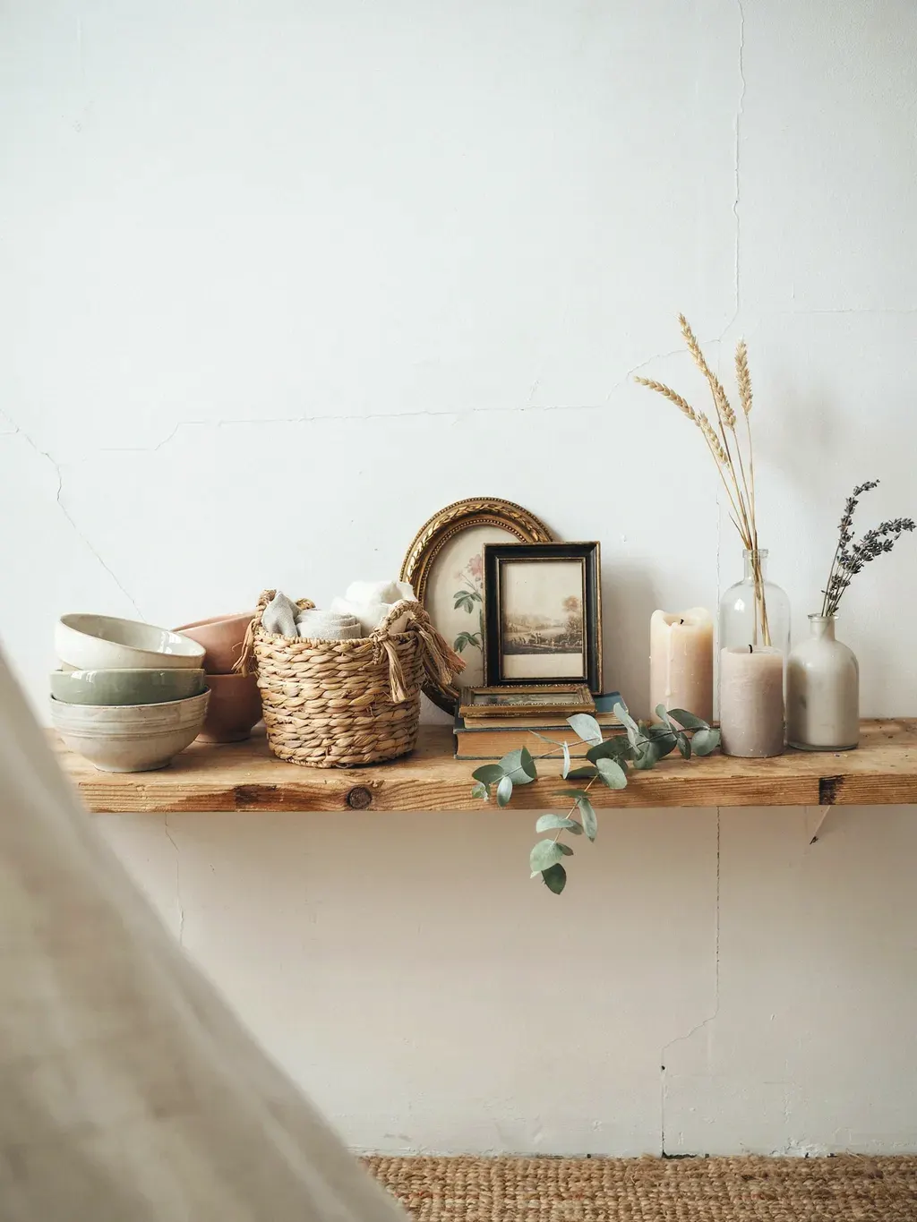
Where available, an As-Is or secondhand department can offer useful single pieces. Check your local store’s service rather than assuming every IKEA location has the same section or stock.
IKEA’s U.S. As-Is information describes a local-store online browsing and reservation service for IKEA Family members. Eligibility, inspection, collection, and return conditions matter as much as the price.
Inspect for the intended use: Check a vase for damage, a basket for broken weaving, and a lamp for its complete components and appropriate safety information. Do not make a damaged functional piece acceptable simply by calling it rustic.
Spend on the Objects You Handle Every Day

Prioritize a comfortable mug, suitable light, or basket that fits your storage over extra decorative pieces. Frequent use exposes poor fit faster than a shelf display does.
Check what comes in the price: an insert, bulb, outer pot, lid, mounting hardware, or additional pack may be needed. Include delivery or collection costs before comparing two options.
Buy less, more deliberately: A single useful purchase that finishes a corner is a better fit for a small budget than several inexpensive items with no assigned place. Save optional decoration until the practical setup works.
Finish the Room Without Making It Feel Overfilled
Repurpose Only Within the Object’s Suitable Use
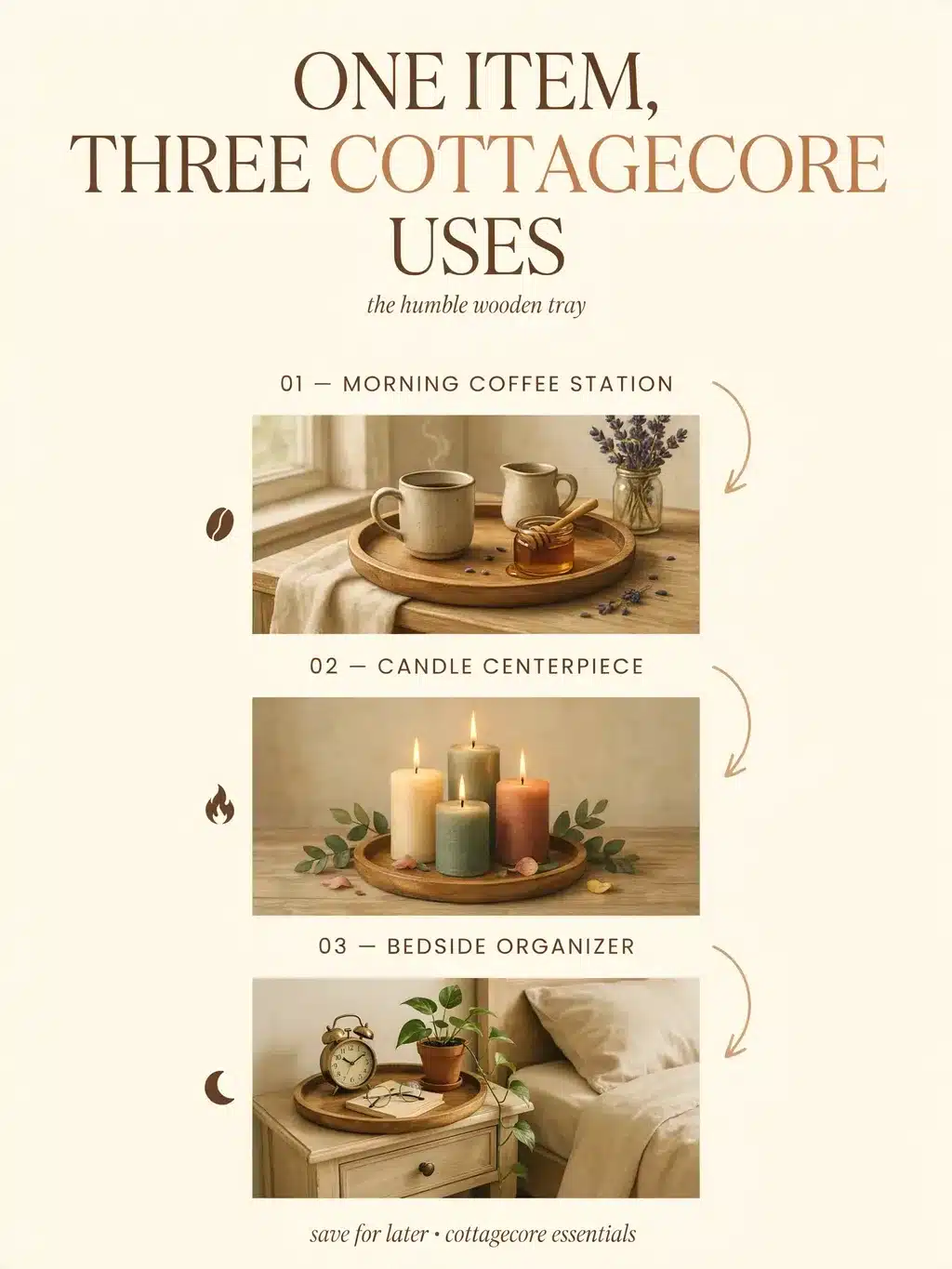
A food-storage jar can also hold dry stems, and a suitable shallow bowl can organize small accessories. Begin with a clean item whose size and intended use fit the task.
A decorative vessel is not automatically a drinking cup, and a tray is not an extra seat or step. Keep food-contact, load, heat, water, and electrical uses within the product’s stated limits.
Styling method: Look for one existing item that can replace a proposed purchase. If a familiar jug works as a vase, spend the money on the missing reading light or keep it unspent.
Keep a Clear Landing Spot on Every Working Surface
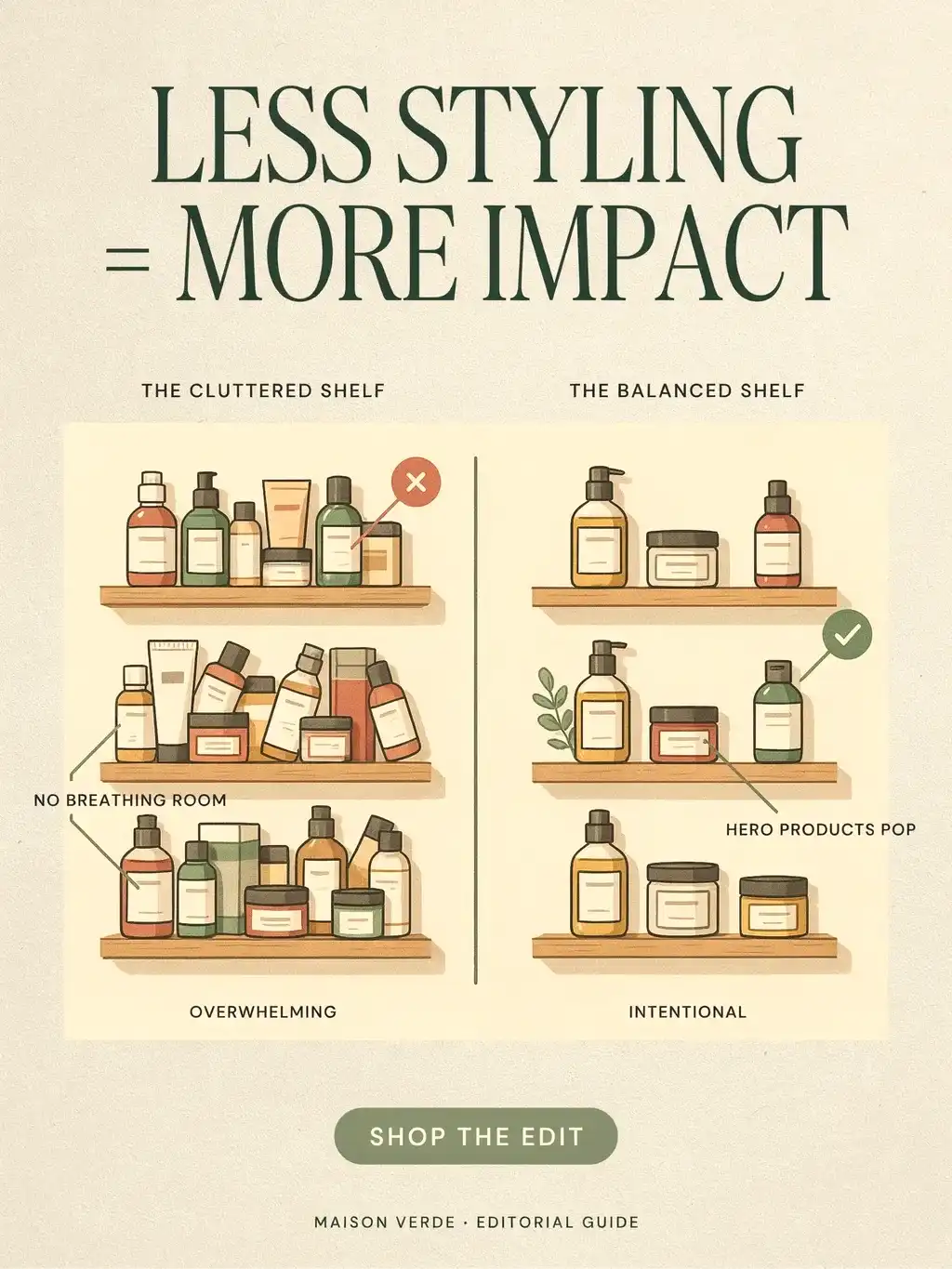
On a bedside table, reserve the place where you put glasses, a book, or water before arranging decor. On a kitchen counter, preserve preparation space. Decorative items should fit around those functions.
Group a few objects together and leave a visible break beside them. There is no universal percentage of empty space required; the useful test is whether you can use and clean the surface without shuffling ornaments.
Quick correction: If a corner feels crowded, remove the least useful object first. Adjust the spacing before replacing it with something smaller.
Mix New Basics With One Personal Piece

A new IKEA vase can sit beside an inherited photograph or a bowl you have used for years. The connection comes from a repeated color, related material, or shared scale rather than a claim that everything is vintage.
Choose the personal piece first and make the new purchases support it. A plain frame can give a drawing room to stand out; a simple basket can organize the supplies for a hobby that already belongs in your life.
Keep the process gradual: Finish one arrangement and live with it before starting another. You will notice what is missing more clearly when the room is in use than when every surface is being restyled at once.
Correct the Problems That Make a Cottagecore Room Feel Busy

Too many small objects: Combine useful items in one basket and keep a larger focal piece outside it. Buying more miniature accessories usually makes the problem worse.
Competing patterns: Keep the strongest floral or checked fabric, then pair it with plain surfaces. You can repeat a color without repeating the whole pattern.
Everything looks newly matched: Add an object you already own or change the placement. A collected appearance does not require buying something artificially distressed.
The display blocks daily use: Move the vase, reduce the number of frames, or choose smaller storage. Comfort and access are part of the design, not details to fix afterward.
Use IKEA as the Foundation, Then Make the Room Your Own

IKEA basics are useful when they give you a simple shape, a practical size, or a material that connects with the room. They do not need to look handmade, and you do not need to disguise where they came from.
Use the plain vase for a few stems, the mug for your evening tea, and the basket for something you reach for. The result feels personal because the objects fit your routines, not because every item belongs to a named aesthetic.
Start with one complete arrangement: useful light, somewhere to set a drink, a little texture, and one piece you enjoy seeing. Add to it only when there is a clear place and purpose for the next item.

